

Picture this. You spend weeks planning a sleek demo video, you pay a studio, your team polishes every screen.
You launch it on your product landing page, wait for the trial signups to spike… and almost nothing changes.
The problem often is not the video itself. It is the placement on a landing page. When the right message shows up in the wrong spot, visitors miss it, skip it, or watch it when they are not ready to act.
For SaaS, where you explain complex workflows and sell to busy decision‑makers, that wasted attention hurts.
A strong demo video placement on your landing page treats the demo as a core part of the page, not a random block your designer drops somewhere.
You decide where to place the product demo video based on how people arrive, how much they already know about you, and how quickly they need answers.That is how a demo video aimed at a higher conversion rate actually does its job.
In this guide you will see how thoughtful product demo video placement on your landing page changes the way visitors read, watch, and click.
You will:
- Look at the three main zones on a SaaS landing page that are ideal for demo videos
- Match each zone to visitor awareness and intent
- Pick simple, testable rules you can apply to your own pages
By the end, you will have a clear plan for where to put your next demo so it supports trials, demos, and new revenue instead of acting like decoration.
Why Video Placement On A Landing Page Actually Matters
A demo video is one of the few pieces of content that can show your product, answer objections, and spark an emotional “yes” in under two minutes.
But when product demo video placement on a landing page is random, that power fades. Visitors skim right past the player, or they watch it at a point where they cannot yet say yes, so your conversion numbers stay flat.
As one SaaS growth lead put it, “Your demo video should not be a decoration; it should be the most persuasive salesperson on the page.”
Good placement lowers the mental work your visitor has to do. When the demo shows up at the exact moment a question pops into their mind, it feels natural to hit play and then click your call to action.
That is where SaaS demo video conversion optimization starts. You are not just adding media. You are matching the video to the stage of the visit.
To make that match, you think about how people arrive. Paid search clicks that mention your brand, cold traffic from content, retargeting from pricing pages – each group brings a different level of knowledge and urgency.
Your product demo video placement should meet each group at the right depth, with the right promise, and with a clear next step.
The 3 Strategic Placements For Your Product Demo Video

When you plan product demo video placement on landing page layouts, it helps to think in three clear zones. Each zone lines up with a different level of awareness and intent.
Above the fold for fast impact
Above the fold is the slice of the screen visitors see before they scroll. This is the best spot when your offer is simple to grasp or already familiar.
If someone clicks a high‑intent paid ad that says “Start email automations in five minutes”, they want quick proof, and a demo right there can do that.
Pair the video with a sharp headline, one strong benefit line, and a clear primary button.
This kind of product demo video placement on your landing page works well when your story does not need much setup.
A short mute autoplay can pull the eye without being rude. Just make sure there is a cue that invites scrolling, so visitors who are not ready to watch can move down the page and discover more.
You can also:
- Add a short caption under the player that restates your core benefit
- Use a thumbnail that shows actual product screens, not just abstract graphics
- Place your primary call to action directly next to or under the video
Mid page for engaged and curious visitors
Mid page placement assumes the visitor has already read your hero section and decided to stay. By this point they want proof, detail, and context.
You might start the page with a bold result, move into short feature blocks, then place the video where those blocks raise new questions.
For complex or technical SaaS offers, this can be the best product demo video placement on a landing page. The copy above builds the scene so the viewer now understands why each feature matters.
Around the player you can add short snippets of social proof, logos, or brief use cases that back up what the video shows.
The video then acts as a bridge into pricing, FAQs, or comparison tables below.
A mid‑page demo works especially well when:
- Your sign‑up ask is meaningful (such as a multi‑step onboarding or paid trial)
- Buyers need to see workflows or integrations before they commit
- You sell to teams who must justify the choice to others
Below the fold for high intent leads
The last zone is near the bottom, after your main copy, proof, and pricing. Visitors who get this far already know they are interested. What they often want now is a deeper look before they commit.
A longer walkthrough or interactive demo fits well here, especially when you sell enterprise features, complex workflows, or multi‑user setups.
In this position, product demo video placement on landing page footers catches people right before the hardest call to action, such as booking a sales call or starting an annual plan.
Because they are already engaged, completion rates and click‑through from this area are often higher. Think of this demo as the closer that repeats your key gains and removes the last bit of doubt.
To make this “closer” section stronger, you can:
- Recap the top three gains viewers will see in the video
- Add a short quote or rating from a current customer near the player
- Place your strongest call to action directly after the video ends
Best Practices To Make Any Placement Work Harder
No matter where you land on product demo video placement on a landing page, the video itself has to earn the click. A sharp layout will not save a confusing script or a clunky player.
The good news is that a few simple rules can lift results in any of the three zones.
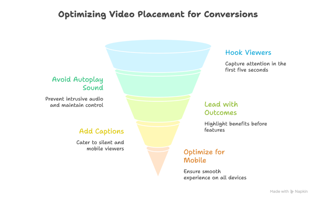
- Keep your demo video 60–90 seconds and hook viewers in the first five seconds. Show key paths clearly without dragging.
- Avoid autoplay with sound. If autoplay is used, keep it muted and add clear controls so viewers stay in control.
- Lead with outcomes, not features, and place a strong CTA near the player. Show real results and make signup easy.
- Add captions for silent and mobile viewers who skim before committing.
- Optimize for mobile and slow networks. Use reliable hosting, compress properly, and test thumbnails and placement to improve conversions.
These habits make every placement work harder without redesigning your entire page.
Conclusion
There’s no single perfect spot for product demo video placement on a landing page. The ideal position depends on traffic intent, product complexity, and buyer readiness.
Above the fold drives speed, mid-page builds clarity, and below the fold supports high-intent visitors. Use these zones as a guide, not a rule. Test different placements, keep your demo benefit-focused, and track play rate, completion rate, and CTA clicks to optimize results.
When strong placement meets a conversion-ready video, your landing page becomes a sales driver.


